TikTok Logo
The Tik Tok logo represents a three-color note (pink, blue, and white) against a black background.
The neon colors overlap each other mimicking 2D music vibrations.

Contents
General
TikTok’s roots go way back to China in 2016. The Beijing software company ByteDance created Douyin; a video-sharing social media service used to create and share short videos of a minimum of 15 seconds and a maximum of 3 minutes in length.
Meanwhile, in the US, a similar app released in 2014 was gaining popularity. It was called Musical.ly.
In 2017 ByteDance acquired the app Musical.ly for $1 billion. After one year of existing side to side, Musical.ly in the US and TikTok on other foreign markets, ByteDance announced that Musical.ly will completely merge with the TikTok app.
Therefore, Douyin remained exclusive to the Chinese market, while the rest of the world benefited from the new TikTok.
TikTok's parent company uses the same social media icon for the exclusive version of the mainland china app.
TikTok logo History

The TikTok icon represents a musical note but the core of the TikTok logo is the “d” symbol.
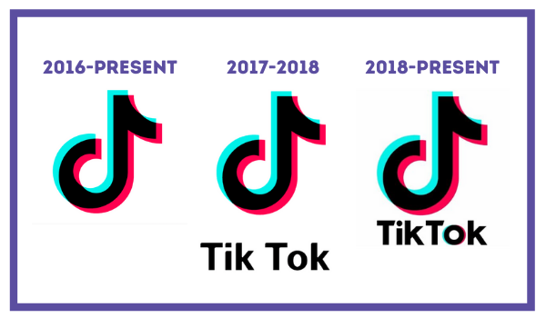
Only in 2017 was the wordmark added to the logo.
Until 2018 the spelling of Tik Tok was as separate words. After this year, the two words came together, the font slightly changed alongside new color accents on the “o.”
The designer of the logo was inspired by the musical scene. He wanted to create a logo that would reflect the experience of being in a theatre or concert, watching creators express themselves on stage.
Representing more than a logo, TikTok finely embodies the essence of its users. It speaks to its creatives more than other popular platforms do.
Alongside other apps like Facebook, Instagram, or Youtube logo, the TikTok symbol has one of the world’s most popular social media logos.